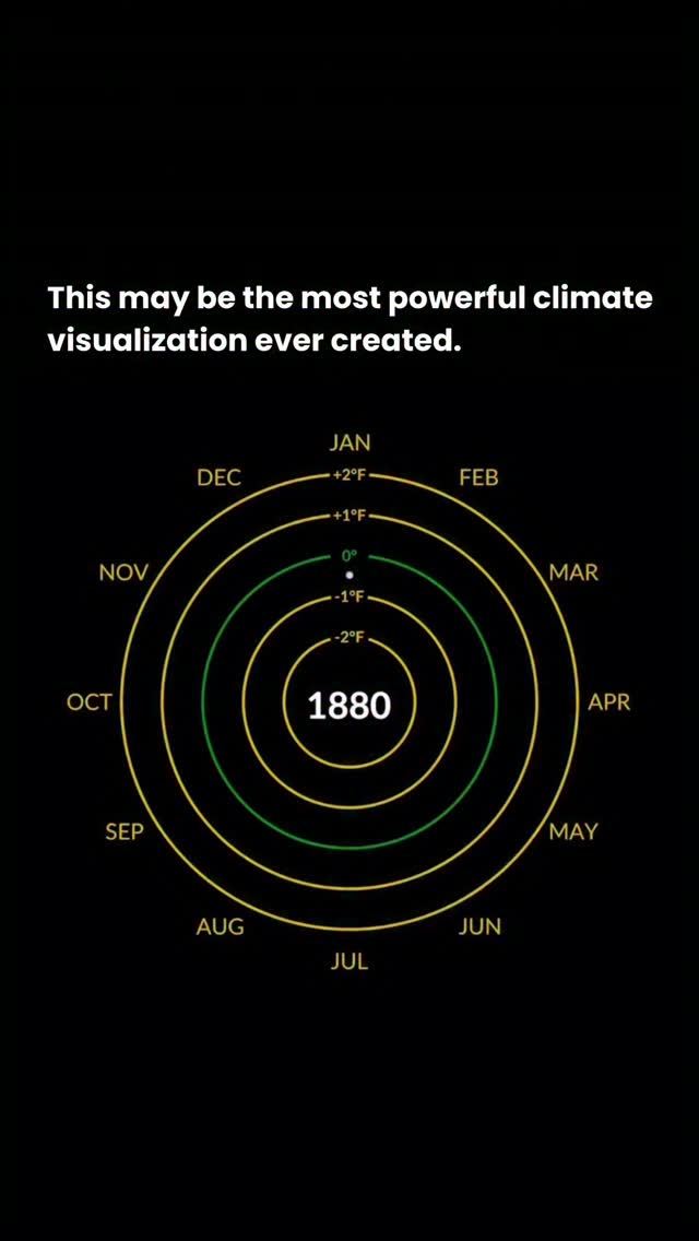
“Ed Hawkins’s Climate Spiral visualizes more than 140 years of global temperature data and clearly shows long-term global warming.”
@evolvingscience.aiReel analyzed by Clear
“The spiral earns its drama: independent records show the same long-term warming.”
NASA identifies the climate spiral as a visualization designed by climate scientist Ed Hawkins. Its NASA version displays monthly global temperature anomalies from 1880 onward, and independent NOAA records likewise show a strong long-term warming trend. The IPCC concludes that human activities have unequivocally caused global warming.
The caption says the 0° ring uses a 1971–2000 average. NASA’s cited Climate Spiral version defines anomalies against the 1951–1980 base period. Also, “most powerful visualization ever” is an opinion, not a verifiable fact.
The baseline-period error is a factual detail, but it does not materially alter a viewer’s central takeaway that the visualization depicts sustained global warming.
Why Clear says this
The central factual message holds up across NASA, NOAA, and IPCC evidence. The post does not claim that a particular single year proves a climate threshold, and its incorrect baseline description does not reverse or substantially distort the displayed long-term trend.
Evidence
- NASA says its Climate Spiral was designed by Ed Hawkins and uses NASA GISS monthly global temperature anomalies beginning in 1880.
- NASA specifies a 1951–1980 anomaly baseline for this version, not 1971–2000.
- NOAA’s independent global record finds 2024 was the warmest year in its 1850–2024 record, with the ten warmest years all occurring in the past decade.
- The IPCC finds human activities, principally greenhouse-gas emissions, have unequivocally caused global warming.